
How Fox News Weaponizes Art + Two Other Illuminating Pieces of Criticism From Around the Web
As January comes to a close, here are three pieces from around
the web that I particularly recommend. Enjoy!
“The Fox News Theory of
Art”
by Rachel Wetzler in the Baffler
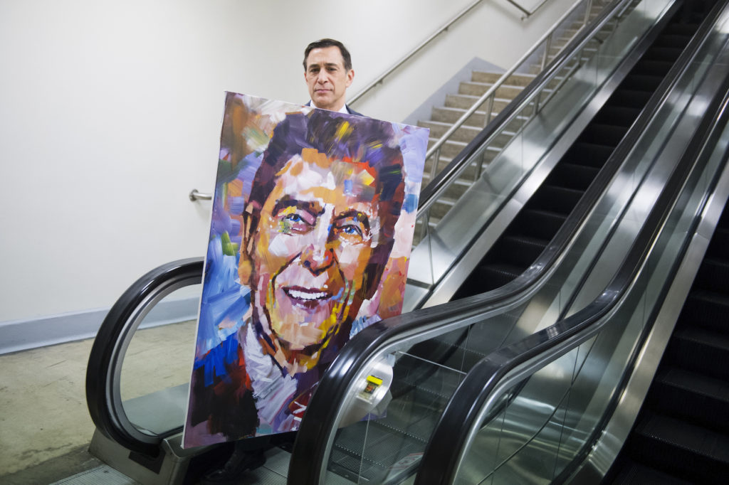
Representative Darrell Issa in the
basement of the Capitol with a painting of Ronald Reagan by artist
Steve Penley. Photo By Tom Williams/CQ Roll Call, via Getty
Images.
Have you ever heard of Steve Penley? I haven’t, but then I guess
the fact that I don’t know his colorfully dappled paintings of US
presidents and American flags just means that I don’t watch much
Fox News.
Penley’s art is more than just a regular feature and symbol of
all that is patriotic on Fox. “You have seen his patriotic
paintings all over Fox & Friends, and actually Fox News
channel—everywhere you go, we see your pictures hanging up in the
halls,” the show’s cohost, Ainsley Earhardt, enthused to an
audience a few years ago, during an appearance by the
“world-famous painter” on the show.
“It’s all over my radio studio now—we took ‘em all!” another one
of the friends, Brian Kilmeade, added. “It’s brainwashing!”
That level of media exposure surely makes Penley one of the
country’s most high-profile painters, whether you’ve heard of him
or not. In a funny way, the right-wing mediasphere has a lot more
use for artists than its liberal cable-media rivals.
Wetzler wades through a lot of Fox News (so you don’t have to)
to find the Fox News Theory of Art, and it’s pretty much what you
think it is: “Only three kinds of art exist for Fox News:
patriotic, stupid, and obscene.”
Any way you slice it, it’s a mainly instrumental view of art: a
given artwork gets the spotlight either because it is useful as
propaganda for the Fox News worldview; because it serves as an
illustration of how dumb and empty-headed liberal elites are; or
because it outrages conservative sensibilities, and so can be used
to rally the troops for the culture wars.
The favored “patriotic” aesthetic tends to channel Norman
Rockwell by way of Andy Warhol, a late-Pop recycling of
comfortingly clichéd American symbols. (Like Penley, the late
Thomas
Kinkade also took direct inspiration from Warhol’s Factory
and described himself as
Warhol’s “heir apparent.”) The best you could say of this work is
that it’s probably more aware of how it operates than the
art-loving public that doesn’t watch Fox
News gives it credit for.
Conservative aesthetics are stereotypically all about taking a
stand against decadent experimental art and for
“real” traditional art. I’ve made a version of this point before
(about neo-Jungian philosopher of
the manosphere, Jordan Peterson), but by putting this art into
the context of Fox News, Wetzler makes the point even more
forcefully: it shows just how classically postmodern this
conservative art is, if by that you mean art reduced to hollowed
out signifiers, mutable performances, and stripped of any sense of
a reality outside of media.
The Fox News view of culture may slam contemporary art as
deliberately valuing offense over enlightenment, spectacle over
skill, ugliness over beauty. But beneath a very thin Rockwellian
veneer, all of this is equally true of the
Through-the-Looking-Glass sensibility of Fox News’s rearguard. You
can’t understand superstar Fox News artist Jon McNaughton’s
One Nation Under
Socialism, a painting of Obama burning the Constitution,
outside of the value it puts on offense—aka “trolling the
libs.”
And you can’t understand Joe Everson, whose shtick is
live-painting the Statue of Liberty while singing the national
anthem, outside of the appeal to spectacle.
“Patriot artist,” “nationally acclaimed flag muralist,” and
frequent Fox visitor Scott LoBaido’s 20-foot-tall image of a
musclebound Donald Trump is about as far from the
profundities of “real traditional art” as Andres
Serrano’s Piss Christ.
What’s it all mean? Probably that you should take Fox News art a
hair more seriously than it is normally taken. Not in the sense of
plumbing it for deep meaning—its meaning seems mainly to be its
appeal to Fox News audiences. But as simplistic and easily mocked
as it is, it’s much more savvy and finely calibrated to be
effective than it gets credit for.
“Rise of the Blur”
by Dushko Petrovich in n+1
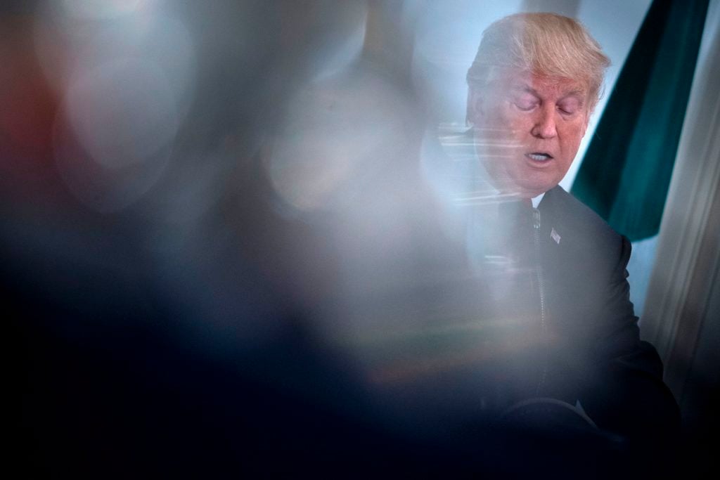
The blur in action: Donald Trump
speaking before a luncheon with US and African leaders at the
Palace Hotel in New York. Photo by Brendan Smialowski / AFP via
Getty Images.
Petrovich, by contrast, reads political meaning in a phenomenon
that you’ve probably seen everywhere and not read much into: the
increasing presence of the blur in mainstream political
photojournalism. “That we don’t fall off our chairs when we see
this tells us how far we have come, photographically, in a very
short time,” he writes. “We are a long way from Pete Souza’s
languid, almost classical compositions on the Obama-era White House
Flickr account, which in retrospect feel tinged with approaching
horror.”
It’s an observant and nuanced essay, with the implication being
that all the blurring is an almost an unconscious aesthetic
symptom, registering a widespread, unnamable sense of looming
dread. On the other hand, such blurry images are also “slightly
virtuosic” and carry “the blush of pure expression.” Petrovich
writes: “I have been told that what I was seeing was just the
increased prowess of the telephoto lens, or merely the resurgence
of shallow depth of field.”
I left the essay thinking it could be both. Photojournalism is
in dire straights, images are cheap and everywhere, and it stands
to reason that the dedicated professionals who remain—who are going
to be focused on political coverage and disaster reporting—feel
pressured to register the individuality of their images with an
arty shot. Wonky blurring is one way to do it. What’s interesting
is that either way—as a symbol of an audience’s general sense of
unease, or as a symbol of the photographer’s intensified need to
register their subjectivity—we arrive at the blur through a sense
of a system in crisis, just by different routes.
“Detective Stories About
Feelings: The Driving Force of Peter Schjeldahl”
by Jarrett Earnest in Momus
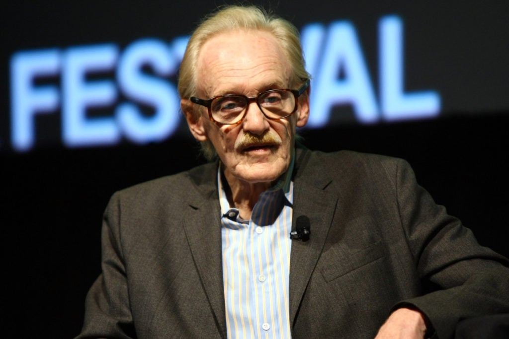
Peter Schjeldahl at the 2011 New Yorker
Festival. Photo by Neilson Barnard/Getty Images for The New
Yorker.
Like a lot of people, I’ve been thinking about New
Yorker critic Peter Schjeldahl and what makes him an important
figure, since his essay, “The Art of Dying,” was
published last year. Earnest’s essay puts a commanding knowledge of
his subject’s writing—he edited Schjeldahl’s recent
book, Hot, Cold, Heavy,
Light—to try to explain Schjeldahl’s Olympian everyman
style.
There really are few writers who have the effect Schjeldahl has:
his writing is almost untouchably on-its-own. But he’s also
exceptionally engaging and reader-directed, and focused on
connecting the circuits of artist biography and personal experience
to make comprehensible a thought, an experience, a way of
seeing.
Earnest describes his articles as “detective stories about
feelings,” which gives a name to what I feel about them. He
mentions Schjeldahl’s own account of his method: “Looking at art is
like, ‘Here are the answers. What were the questions?’’ he once
told me. ‘I think of it like espionage, ‘walking the cat back’—why
did that happen, and that?—until eventually you come
to a point of irreducible mystery.’”
The post How Fox News Weaponizes Art + Two Other
Illuminating Pieces of Criticism From Around the Web appeared
first on artnet News.
Read more https://news.artnet.com/art-world/the-critical-roundup-3-essays-1765221
Further reading


Leave a comment